Feedback is the number one factor when you are planning and managing your projects. In order to prioritize and add (or remove) tasks, you must know how the project is doing. For this you need data -- relevant and up to date. Gathering project status data is time consuming, boring and disruptive. So you need to strike a balance between how much info you want and what it costs to gather it.
Speaking in agile terms, we are talking about an informative workspace where both the team and stakeholders should, at a glance, be able to ascertain current project status. One part of this puzzle is burn up and burn down charts. They are used for different purposes:
A burn down chart is used during the iteration and displays estimated work left to complete all tasks in the current iteration.
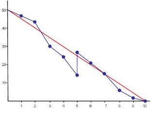
This chart answers the question: Is it possible to finish the current iteration on time? The x-axis is time (days) and the y-axis is estimated work left (hours or points).
Each day, the team gathers in front of the chart and adds a new point to it.
Blue points shows work left and red is the ideal. The team is finished when the blue line reaches zero. This example shows a two-week iteration.
A burn up chart is used to for long term planning (release planning) and shows how much work is completed. It is slightly more complex, but conveys a more information than its burn down friend. It answers question such as:
- Is our velocity stable over time?
- How much work is left before release?
- Are we removing or adding stuff to the backlog?
- What is the projected prognosis for completion?
It is also a great tool when performing post-project retrospectives and is an excellent communication tool to use as a status document for absent stakeholders.
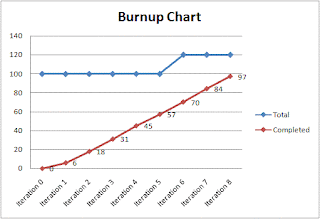
Burn up charts displays iterations on the x-axis and accumulated story points in the y-axis. When the iteration is completed, you just sum up all completed stories (ie. your velocity) and plot it on the chart. In a perfect world, the result should give you a straight line (constant velocity).
The blue line shows total planned work and the red displays produced work for each iteration. Note the bump between iteration 5 and iteration 6. This shows that the red velocity was constant, but more work was added to the backlog (or estimation changed).
In summary:
- Use burn ups to see how much work has been completed and to plan and calculate releases over several iterations. I recommend using one-week iterations. If that is not possible, just plot each weeks work anyway. Completed story points is the measured unit here.
- Use burn downs if you need daily progress reporting and update the chart duringstand-up meetings. Risk for "micro management" here, so don't draw any conclusions to early! Use hours.
- You can use burn ups during the iteration as well.
No comments:
Post a Comment
What are your comments? I'd love to hear 'em, so don't be shy now :-) If you want to get in touch with me directly just drop me a mail.